
Mobile Banking Application Design
#InformationArchitecture #Collaboration #Implementation
Professional Team Project l KBTG, Thailand l Oct 2017 – Oct 2018 l Role: UX/UI Research and Design, Information Architecture
Context
In the age of digital disruption, financial services need to reframe itself and blend into customers’ lives to survive. The goal of the project is to revamp Kbanks’ existing banking application towards a more lifestyle approach and to facilitate newly-developed AI recommendation features. To develop closer relationships with customers than a mere service that ‘moves money’ from an account to one another is the main challenge.
Outcome
The application was launched and used by 14 M+ active users (in 2021). It becomes the application with the most active users in the financial category and the 8th of all applications in Thailand.

The Challenge
What are the ‘meanings’ behind ‘transactions’? How can it be emphasized and integrated into the application?
Understand
The meanings behind transactions
User Research / Market research / Collaboration with Kbank strategists
From different meanings to the design brief
Design Statement
How might we create a banking application that is ..meaningful, personalized and seamless... .


The Challenge
How can information architecture help to introduce lifestyle features within a banking application?
Understand
Why the existing flow impedes new feature's observability and accessibility
Flow Structure Analysis
The flow structure of the existing application was ..top-down. , which pulls users to dig into the app and find the feature for which they are looking. Although the bank plans to introduce the lifestyle features and financial service recommendations, some obstructions hamper users to explore the lifestyle contents.
Firstly, the lifestyle mode was ..located separately from banking mode. .,but most users undoubtedly direct to banking mode when they still do not know there are new lifestyle features.
Second, the first chance users got to see the lifestyle content was in ..the second level.. .of the flow.
Lastly, ..the login screen. .,that seperates the users' experience into pre and post login phases, acts like a gate that limits exploration and further reduce new feature observability.
Design
New parallel structure to engage users
Information Architecture
Collaborating and moving to hi-fi
Wireframe / Flow Development / Screen types and guidelines
Following the concept mentioned above, I collaborated with the product owner teams to create many iterations of low-fidelity screen flow. The screens and UI elements such as fonts, buttons, bars, or fields were grouped into types, and, through a collaboration with visual designers, those design guidelines were turned into high-fidelity screens. Later on in the process, the design was migrated into a design system in Sketch and delivered to developer teams through Zeplin.
One iteration of wireframe flows (Part 1)
One iteration of wireframe flows (Part 2)
Drafted screen types and UI elements guidelines

Mango Zero, a digital channel, interviewed me and the team about the development of K PLUS
Outcome
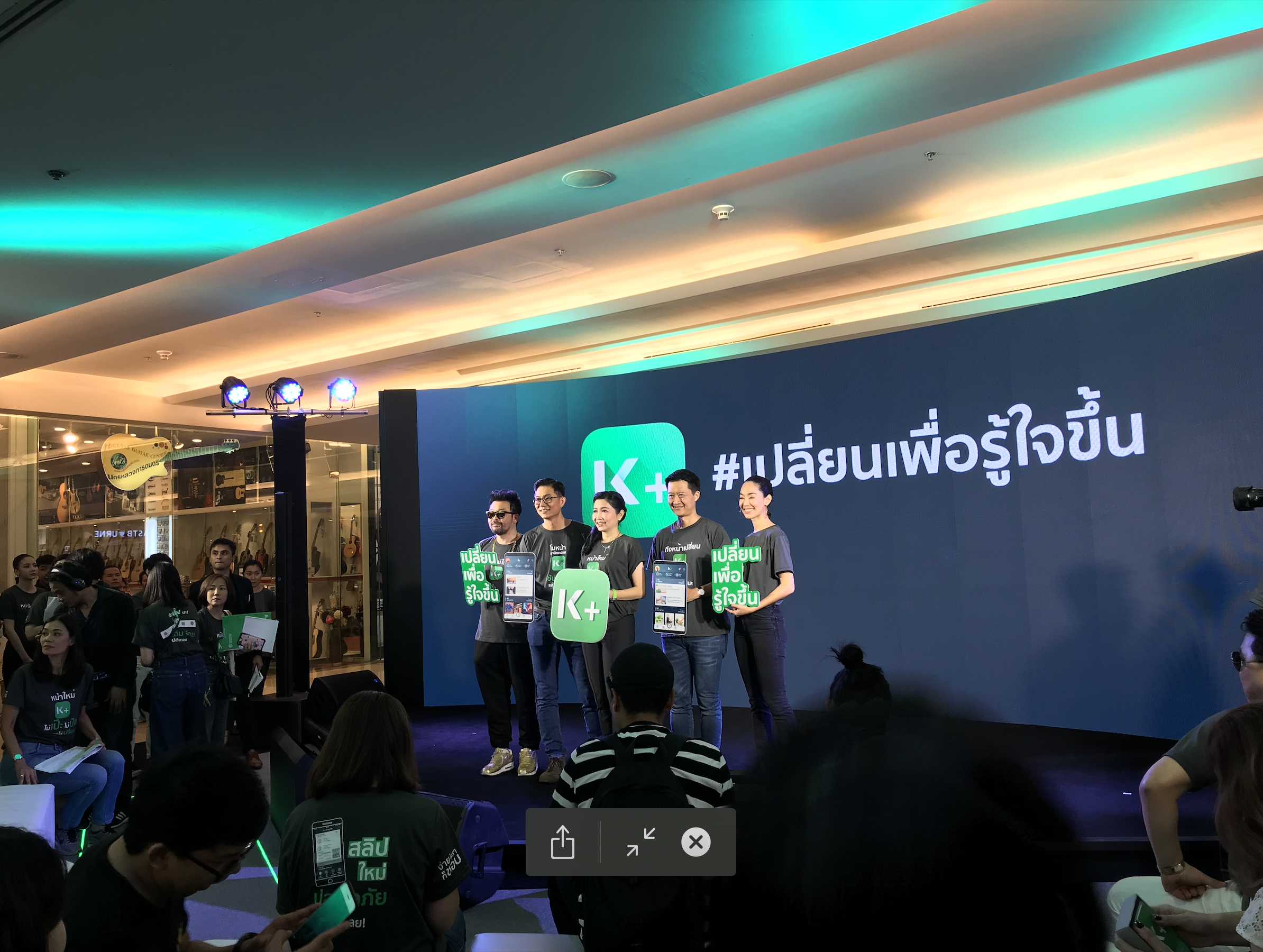
K PLUS - a mobile banking application of Kasikorn bank.
After the launch, it can enhance the user experience for both new and existing users with the smallest transition from the previous version to this new design.
Take a glance at K PLUS at https://www.kasikornbank.com/kplus
Download K PLUS from App Store l Play Store


Key Takeaways
Experiences derived from the project to the design of the team's new workflow
Insight from colleagues / Work process design
From this organization-wide team collaboration, the outcome is not only the launch of the app but also an idea of the design team's workflow, I developed, to enhance my team's work process in the future. The development of the new process was based on the insights gathered from each team during the project.
